 Roopnavarro Says:
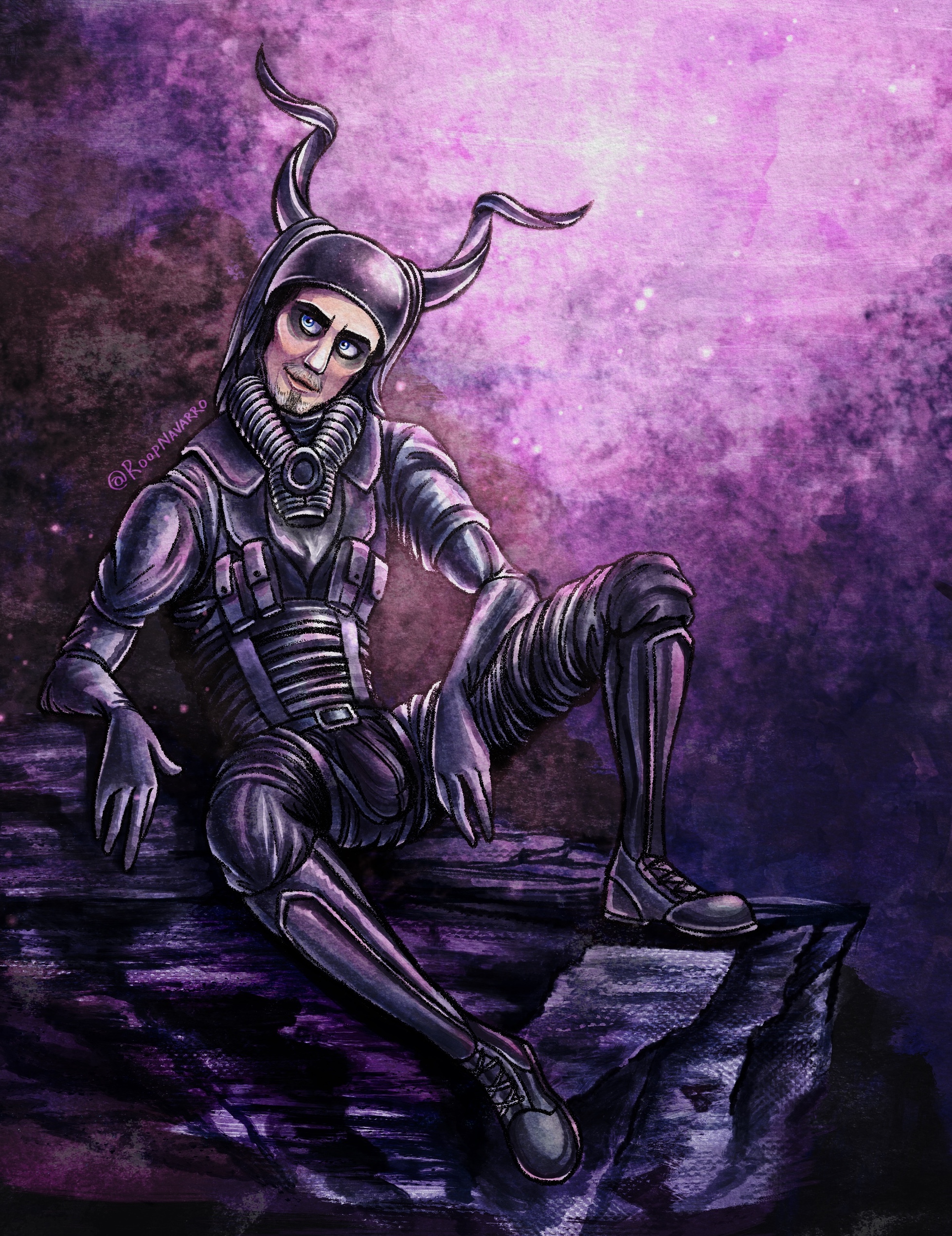
This was my first shot at drawing Octoboss! I didn't even know the character's name yet. And all I had to work from was this low-res behind-the-scenes leaked photo. I was really fighting for my life trying to figure out the details of his costume. His helmet's a bit off model, but eh, whatever. And I deliberately left out some bits on his costume just to keep his silhouette clear and readable in this weird pose.
I still genuinely have no idea what's going on with his costume. As of the time of this writing (03-16-2024), we haven't gotten a clear breakdown of whatever it is that he's wearing. But I won't let that stop me!
Weird horned helmets and quirky fashion choices aside, coming up with a color scheme for this painting was a trip. I wanted to do something I hadn't seen in Mad Max fan art before, so I went sparkly goth unicorn mode on this one. I kinda like it for Octoboss.

 Roopnavarro Says:
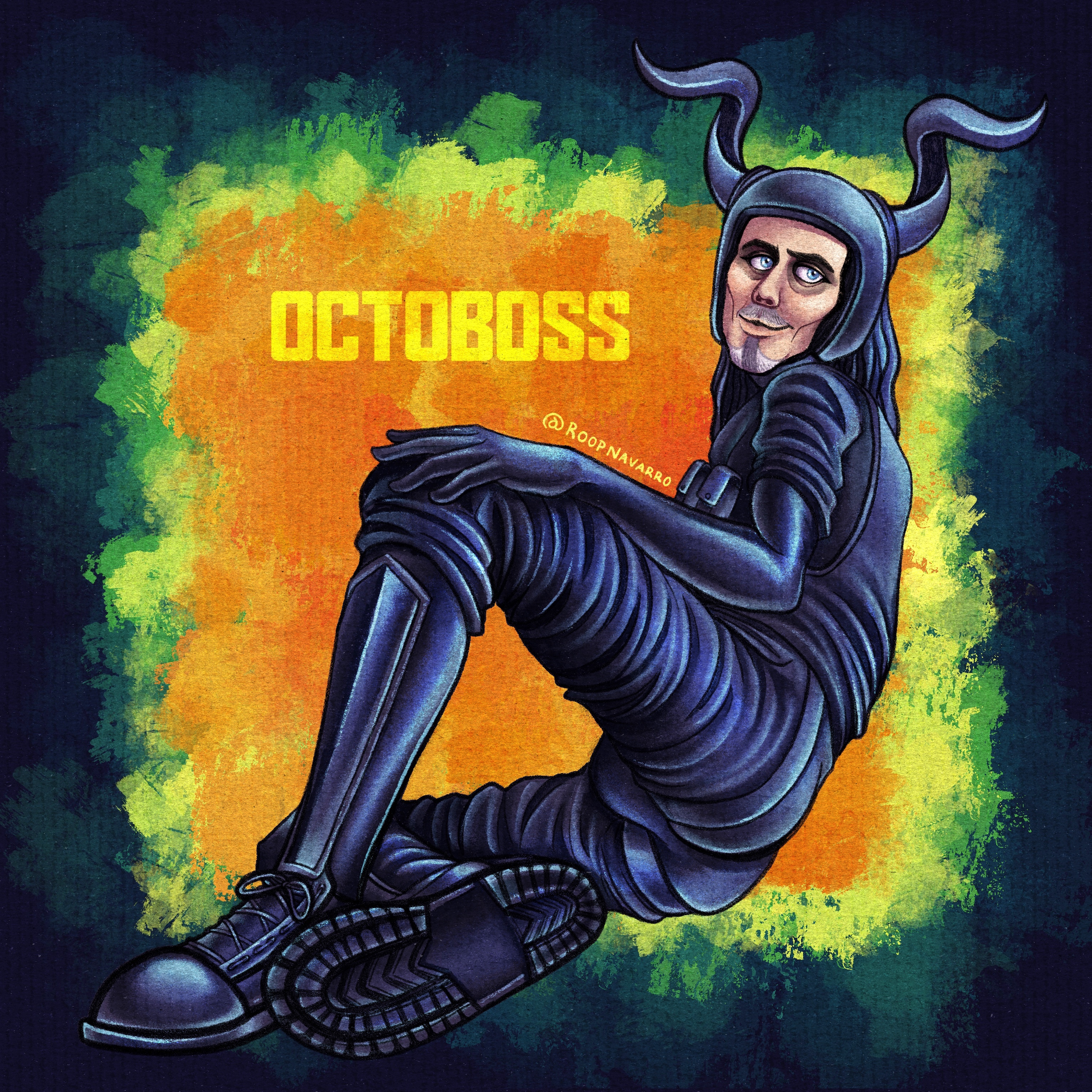
For this one, I really wanted him to fit in a square frame (blame Instagram). However, Octoboss is a pretty long noodley boy, which meant I had to find a pose that would squish him into this little square canvas. After much hemming and hawwing and a painful amount of thumbnail sketching, I settled on this scrunched pose, which turned out to be a real exercise in foreshortening.
Once again, I went for an unconventional color scheme for Mad Max fan art, but I think it works. I'm not really committed to using any particular tint for his clothes. Plain black seems a little underwhelming with these wilder color palettes, so expect to see this costume tinted purple or blue pretty often in my interpretations of Octoboss.

 Roopnavarro Says:
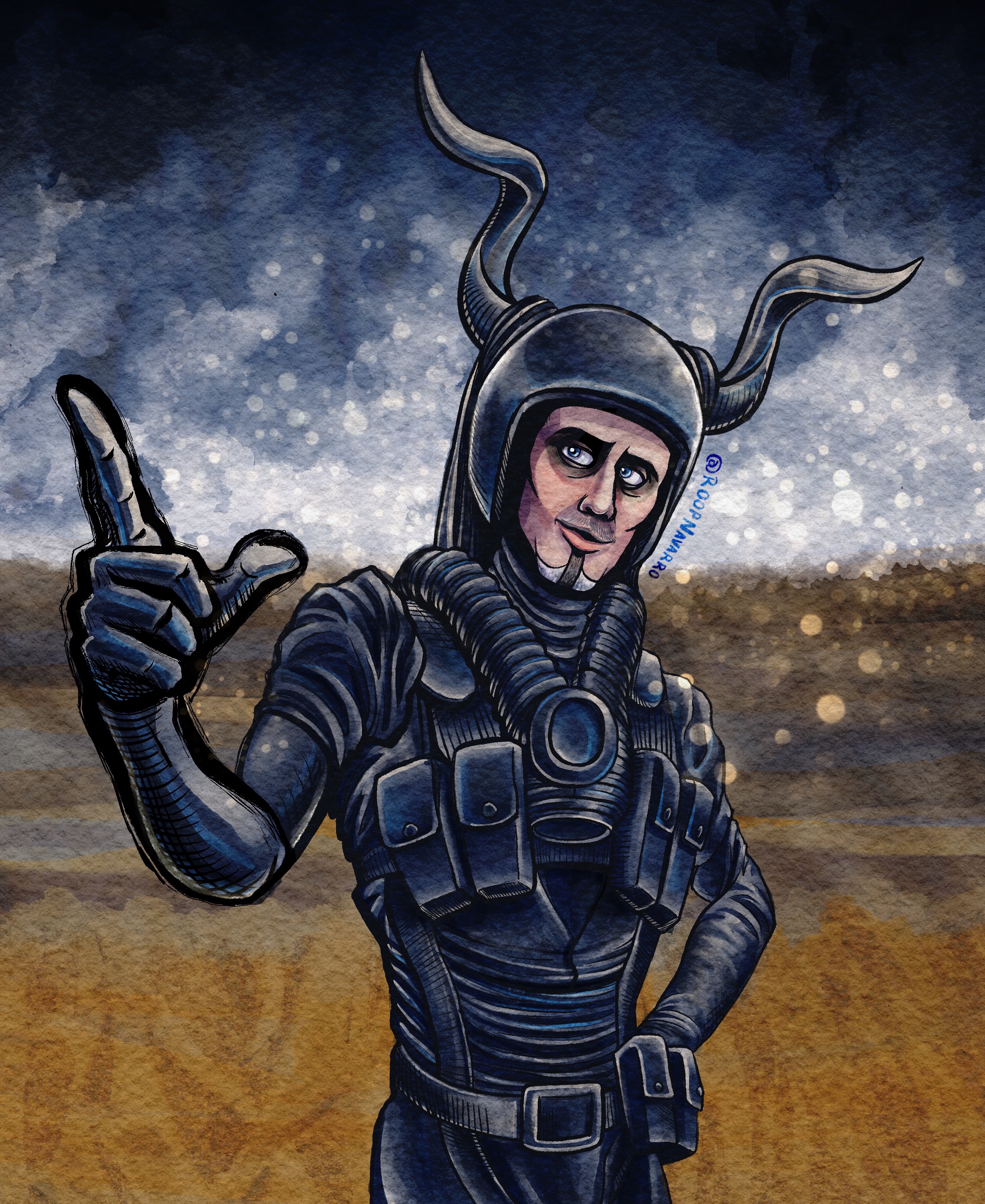
Finally! I actually used a normal color palette.
I'll admit I know nothing about this character's body language. But hey, posing him like this was fun! Inking this was a blast. I love putting a heavier line weight on parts closer to the viewer.
I just know Octoboss is gonna be one of those characters I treasure for the rest of my life.

 Roopnavarro Says:
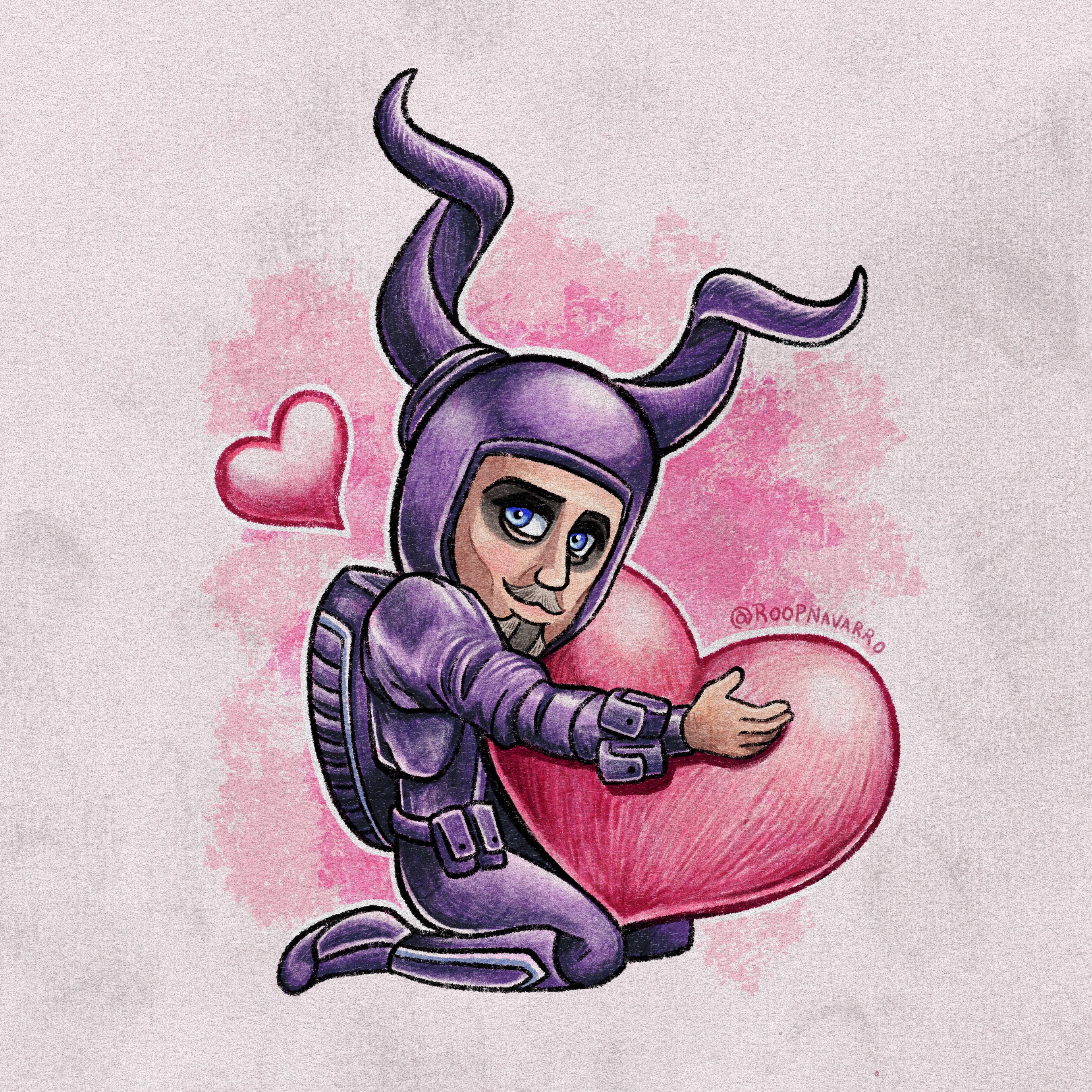
Cute or cursed? Why not both?
If it's not obvious by now, I absolutely adore Octoboss' design. His helmet, his weird puffy shoulders, his itty bitty waist, the whole thing. He might be my favorite Mad Max character design of all time (blasphemous, I know. Yes, Joe, Bullet Farmer, and Toecutter are still in the top 5 for me.)
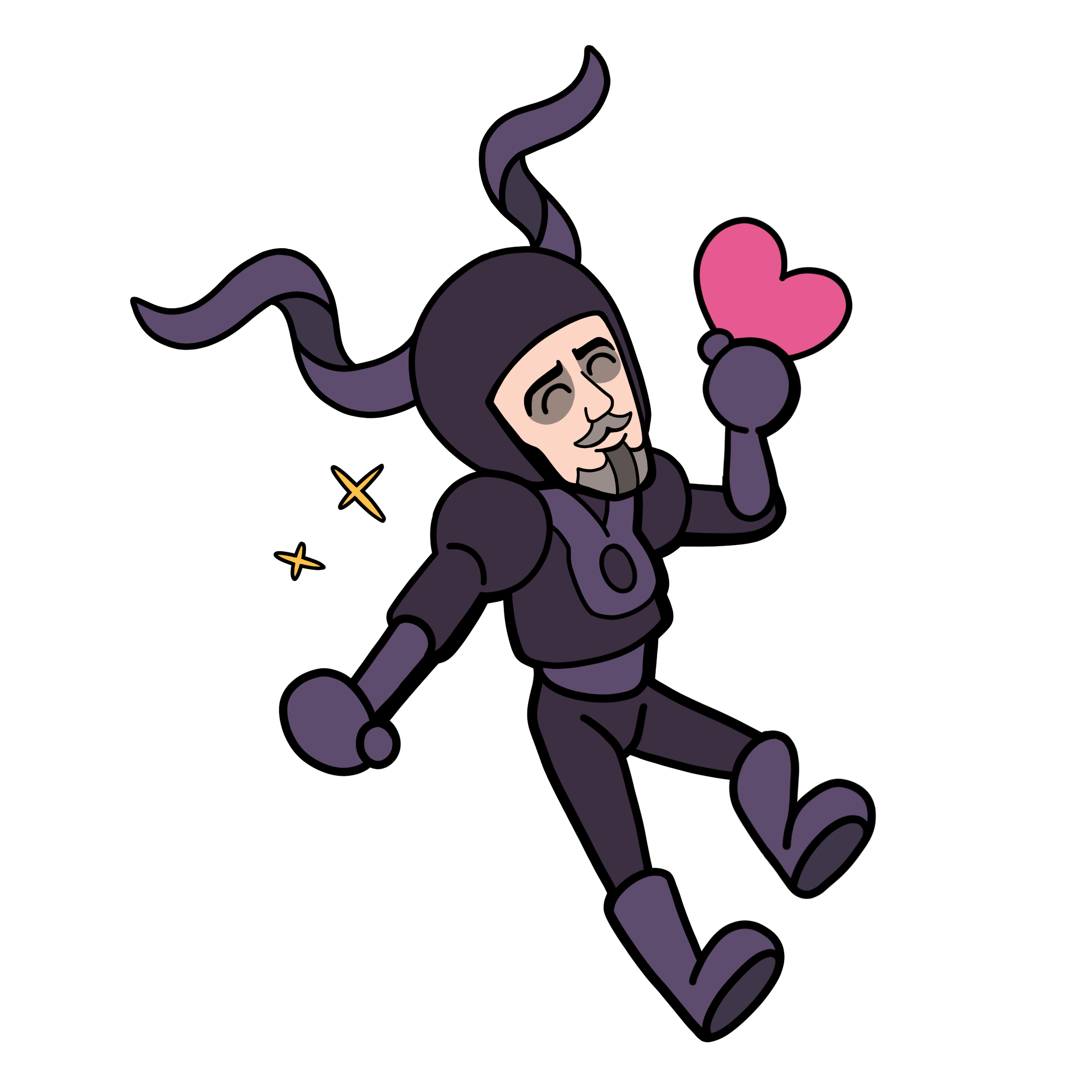
I think I adore the fact that his silhouette is so immediately recongnizable — and I believe Miller and co. know that, hence the reason they flashed him onscreen for a half-second in Furiosa's flashback shown in the second trailer. But in addition to his weird lanky silhouette being burned into Furiosa's mind as an integral part of her trauma, I find Octoboss' overall look to be... Not that threatening? If anything, I consider him to be quite cute. Just look at him! He's like a goofy little jester spaceman! Adorable! Round! Babey! He's going to share that love heart with you!

 Roopnavarro Says:
The chibi-fication of Octoboss continues! Have I no decency? Not a shred!
If you ask me, Octoboss is truly a masterclass of character design. I have stripped so many details off his costume, and yet he remains recognizable. Seriously — I took his ammo pouches, his strappy harness things, virtually all of the details on his breathing apparatus(?) and yet, he remains recognizable. That's a killer design, right there.
For this picture, I wanted to go for a super-simplified look — almost a Paper Mario vibe. I think Octoboss works well in this style, and I can't help but wonder if it's because the Furiosa movie went through a phase where it was an anime. I wonder if there's anime-style concept art of Octoboss? I really hope an artbook comes out to accompany the film. I want to hear all about the design process for this character.
